独占ニュース:フィル・シラーが語るApp Storeの3つの改善

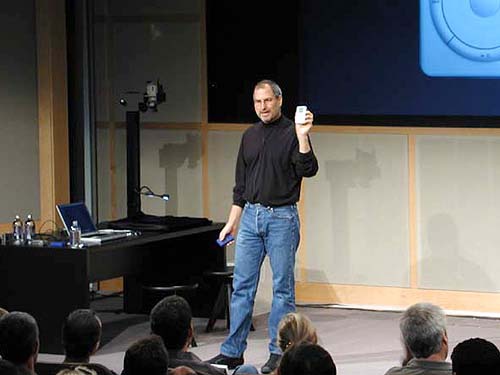
フィル・シラー氏
今週に入り、突然、アップル社上級副社長のフィル・シラーが電話で独占インタビューに応じたい、という連絡を受けた。
アップルの東京オフィスで電話に出るとシラーは「来週のWWDCではかなり盛りだくさんの発表を用意しているので、これまでにない試みとしてWWDCの前週に、メディアを通して事前にいくつかの発表をすることに決めた」と言う。
「そうすることでWWDC参加者たちが、どのセッションを受講したらいいか、あらかじめ計画を立てられる」という目論見のようだ。
発表は主に3つ。いずれもApp Storeに関するものだ。
--
まず1つ目は、App Storeの審査プロセスの迅速化。
これまでは約1週間かかっていたレビュー期間が、50%のアプリは24時間以内。90%のアプリが48時間以内に審査完了になる持続可能な体制を築いたという。実はこれは既に数週間前からそうなっているようだ。
--
2つ目は、サブスクリプションモデルの全面解禁。
もともとは日本の携帯アプリビジネスの主流だった月額課金型モデル。日本では一時、数千億円規模の市場があったが、アップルは慎重で、最近になってようやくサブスクリプション型サービスを始めたものの、映像/音楽の配信サービスやニュース配信、クラウド型サービスなどジャンルを絞っての提供となっていた。
しかし、秋頃には、これが全面的に解禁され、どのアプリでも利用できるようになる。
さらにサブスクリプション課金においてのみではあるが、これまでのApp Storeの慣習であった70:30の利益分配も変更を行い、2年以上月額課金を継続しているユーザーの売り上げは85:15の比率で分配をするという。
継続して使いたくなる良質な改善を促す試みだ。月額課金開始の実績はルール改定前に遡って起算をする。つまり、新ルール実施直後から、85:15比率の恩恵を受ける開発者が出てくるようだ。
また、一つのアプリ内で複数のグレードのサービスを用意し、サービスグレードの上げ下げや、同じ価格帯の別サービス(例えば番組パッケージ)への切り替えなどの機能も用意する。
課金用の価格帯も200種類に増やす。
また国単位で別の価格設定も可能にする。
なお、アップルは顧客が、不要なアプリの月額課金を増やしすぎて、月々の支払いが増えすぎないように月額課金中のアプリを集中管理する画面を用意する。
[追記:アップル社が提供するサブスクリプションサービスは、月額課金だけに限らず、例えば3ヶ月ごとに課金などのモデルも用意される]
--
3つ目は、検索広告だ。現在、App Storeでのアプリのダウンロードの2/3は、App Storeでの検索経由となっている。
そこで、Appleでは、検索結果の1つ目に開発者からの広告を表示するように仕様変更を行う。
検索広告は、Second Price Auction(2番目に高い入札額を選ぶ)という方式で価格設定を行い。その上でキーワード単位での独占は許さず、複数の入札があるキーワードに対しては、まずはアップル社が選んだ関連性の順番で順位付けしローテーション表示する(常に表示する広告は1件のみ)。
広告費はクリックした時のみに発生するが、クリックされない広告は関連度のランキングが下がるしくみになっている。
なお、ユーザーのプライバシーを重視するアップル社では、開発者に対して、広告の効果に対するレポートは出すが、ユーザーに関する情報は一切出さないとしている。
こちらのインタビューの詳細はITmediaのPC Userにおいて、ここに書いたこと以外も詳細にレポートする予定で記事の準備を進めてが、ITmediaのCMSのトラブルで掲載予定時間から40分が過ぎても記事が掲載されないため、急遽、こちらのブログに要約を書き起こした。
3D Touchの絡め方など詳細についてはITmedia PCUserの記事を参照してほしい。